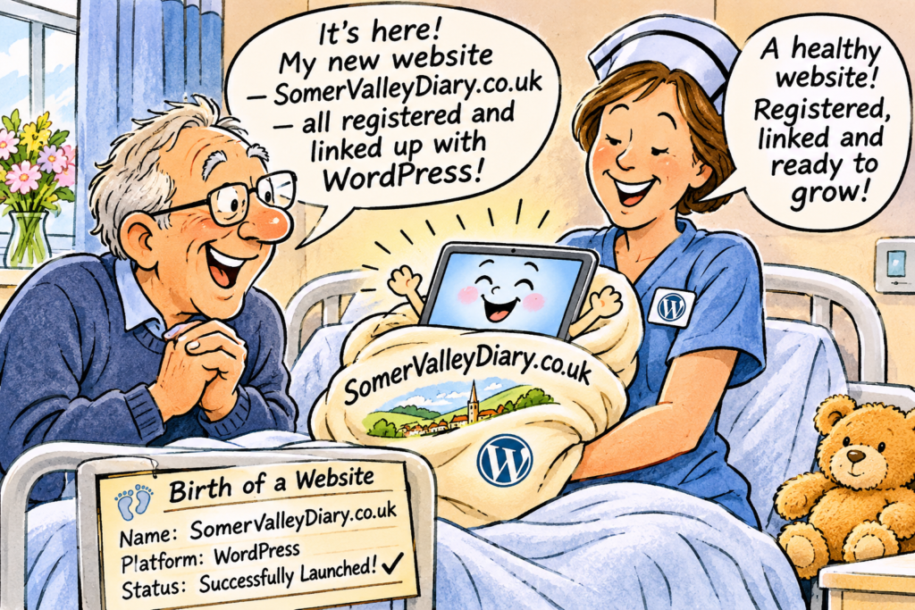
There is something rather exciting about the birth of a new website. It begins with an idea, develops through a period of gestation, and eventually arrives in the world, hopefully without too many complications. Like any proud parent, the creator believes the new arrival is beautiful, intelligent and destined for great things. Whether the rest of the world agrees is another matter entirely.
I have just registered my new website, SomerValleyDiary.co.uk, and connected it to WordPress. The baby has been born, but it has yet to learn to walk, let alone run. There is a considerable difference between having a website that technically works and one that people actually enjoy using.
One of the greatest dangers is over complication. Website designers, particularly enthusiastic ones, are sometimes tempted to include every conceivable feature. Drop-down menus multiply, categories proliferate, buttons appear everywhere, and before long the visitor needs a map and compass to find the information they came looking for. It is rather like entering a supermarket for a pint of milk and discovering that the milk department is on the seventh floor, accessible only through the gardening section.
Another problem is that designers often know their creations so intimately that they cannot imagine anyone getting lost. They know exactly where everything is because they put it there. Unfortunately, the first-time visitor does not have this advantage. What seems obvious to the designer may be completely baffling to someone arriving for the first time.
This is where **beta testing** becomes essential. Before launching a website to the public, it should be tried out by ordinary people, preferably those who know little about computers and have never seen the site before. Give them a simple task, such as finding a local gardening club or discovering what is happening next Thursday, and then watch what happens.
The important thing is not to help them. Every time they hesitate, click the wrong button or ask what something means, the designer has learned something valuable. A website that needs constant explanation is not yet ready for public use.
There is also the danger of designing for the wrong audience. Young, technically confident developers may assume that everyone is comfortable with tiny text, mysterious symbols and complicated registration procedures. But a community website needs to accommodate people of all ages and abilities. Clear lettering, straightforward menus, obvious contact details and a prominent search facility are not luxuries. They are essentials.
Mobile phones introduce another complication. A website that looks magnificent on a large computer screen may become an incomprehensible jumble on a small phone. Pages must load quickly, buttons must be easy to press, and visitors should not have to enlarge the screen simply to read a telephone number.
Then there is the question of maintenance. A website is not a book that can be printed and left on a shelf. Information changes, organisations close, new groups appear, and events are cancelled. A community diary containing out-of-date information can quickly lose credibility. Keeping it alive requires regular attention and, ideally, contributions from the organisations themselves.
I am particularly conscious of the danger of becoming too attached to one’s own creation. Having spent weeks or months developing a website, it is tempting to defend every feature against criticism. Yet the most useful question is not, “Do I like my website?” but **”Can a complete stranger find what they want within thirty seconds?”**
For Somer Valley Diary, the objective is deliberately simple. Someone should be able to discover what is happening locally, find an organisation that interests them and make contact without unnecessary complications. The website should be a welcoming doorway into community life, not an obstacle course.
A successful website is rather like a good host at a party. It welcomes visitors, introduces them to the right people, makes them feel comfortable and does not insist on explaining how clever it is.
And, like bringing up a child, the real work begins after the birth. There will be teething troubles, unexpected tantrums and probably the occasional sleepless night. But with patience, good advice and a willingness to learn from mistakes, the youngster may eventually grow into something genuinely useful.
**The ultimate test of a website is not how impressive it looks, but how easily people can use it. If visitors leave feeling helped rather than frustrated, the proud parent has every reason to celebrate.**

0 Comments